Insta360 One X

Highlights

  • 5.7K 360 video, 4K at 50fps and 3K at 100fps

  • Amazing stabilization

  • Livestreaming, timelapse, overcapture, and slow motion

  • Great value for the price

SgfoSxI[1].jpg
Mw8Yz0q[1].jpg

Overview

This is a camera that really stands out among the crowd.  The intention behind this camera is for it to be a contender to the GoPro lineup, and the engineers were able to put together an amazing flagship product.  

The One X features a small LCD screen, which I found helpful navigating the options.  There are two buttons - one big and one small - to help navigate the menus.  By default the user experience will either be straightforward or painful - there really is no middle ground there.  Fortunately the One X takes the straightforward route.  The camera body is a sleek plastic that is easy to grip and feels like a premium product.  The devices houses a removable battery, which is a good feature.  I read that you can run the camera on an external USB battery - though I never tested it.

The One X features something called overcapture, which means you can record a 360 video and edit it down to a regular dimension.  Essentially the camera captures everything around it and you decide what you want to focus on.  This could be convenient in a classroom setting where there is motion and you want to determine post-hoc what makes it to the screen.

This camera features the highest resolution from what I was able to test, up to 5.7K.  It records colors and light accurately but doesn't always do great in direct sunlight.  The color correction features do well with adding depth and life to the footage.  The stabilization and stitching is among the very best on the market.  

The HDR mode (high dynamic range) really boosts the photography in this camera.  The 18MP camera is not the best for photography, but it doesn't do a bad job.  The lenses in the camera are very high quality and low light is captured with less noise than one would expect, though it does much better in well lit situations.  For pictures used within Canvas, the image quality will be fine.  For those who really like to tinker with their photos in post-production, the One X can shoot in RAW.  

The app can be challenging to work with while capturing footage, but for editing the video on the phone it really excels.  You can adjust exposure, color temperature, contract, saturation, and several other settings.  You can also create smooth panning, hyperlapse, and slow motion effects all in the same video.  The phone editor is intuitive enough, but you'll likely want to do the editing on computer software.

Ultimately, the One X is an action camera and is great for people on the move.  This camera also has multiview, similar to the Nano S.  Snowboarders, sky divers, hikers, and skaters can capture amazing footage with this device.  In academia, this could be good for campus tours, field study, or other activities that involve motion or action.  The GoPro does shoot better quality video, but the One X is a fraction of the cost.  The software is easy to use, the lens quality is great and helps with indoor and low light shooting, and the color correction is helpful.

Pros Cons
The app is amazing for editing The app is finicky during capture - I had several connectivity issues
Removable battery No microphone input
Simple to use Many features that likely wouldn't be used in academia (e.g. bullet time)
Excellent stitching Support is not always responsive or helpful
Amazing stabilization Many reports of footage saved internally and not recording onto SD card
Upload or livestream to Facebook from app

Video Examples

Grand Floridian

Magic Kingdom

Bonus: Splash Mountain


Photos


Vuze+

Highlights

  • Stereoscopic 360 = true 3D VR

  • Livestream 4K 3D

  • 4 microphone spacial audio

  • Durable - water/dust/dirt resistants)

yA2Vlnq[1].jpg
XnPAyRm[1].jpg
ycsWqVt[1].jpg

Overview

The Vuze+ is the only product on this list that is truly a prosumer device.  A true professional camera will probably cost around $3,500, and this device is a small fraction of that, but it is still much more expensive than any other camera we tested. 

What differentiates this camera is that it is the only device that captures 3D video.  It does this by utilizing two separate cameras on each face.  One camera captures the left eye perspective and the other captures the right eye.  This allows people to have a depth perspective, in addition to a 360 experience.  For the best 3D experience, the viewer should use a dedicated headset, such as an Oculus device, as opposed to a phone in a VR viewer.  Although smartphones have good resolution, each eye only sees half the screen which is then magnified greatly - resulting in a bit of pixelation.

One of the challenges with the Vuze+ is leveling the device.  I discovered very early on that without a tripod, the camera will likely have a distorted horizon line.  When it's not level, essentially one side is going to be pointing toward the ground while the opposite side is pointing skyward.  The viewer will see a wavy horizon line which will be confusing an unprofessional.  The app helps by showing a real-time camera leveler.  The app includes real-time previewing, which helps greatly to indicate if the footage is not level and what adjustments are needed.

The camera is incredibly sturdy and able to withstand dirt, dusty, and splashes.  For real submersion, Humaneyes released a waterproof case.  One word of advice I have is to wipe the lenses with a dust-free microfiber cloth prior to shooting.  With eight different cameras, it is easy to overlook a smudge, and though the case does a good job of protecting the device, it doesn't necessarily wipe down the lenses.

For such a hefty device with so many adjustments and settings, it is actually very simple to capture footage.  The app is very intuitive, but you can also capture right on the device as well.  I listed the manual adjustments available in the table below as both a pro and a con.  It can be overwhelming to someone new to 360 video (or photography in general), but also allows the operator to have a great amount of control in order to shoot the best footage possible.  It's a mixed bag.  The Humaneyes computer app for post-production can be overwhelming, but there are tutorials to help people familiarize themselves with the features.  The app helps you to refine stitching, color match, adjust levels and blending, and stabilize the footage.

Now each, camera shoots 4K video.  There are eight cameras, so if you do some quick math you will realize that that's a whole lot of K's.  It amounts to recording approximately 1GB per minute.  Fortunately we can buy 256GB MicroSD cards for fairly cheap these days.  I use 512GB just so that I don't have to worry, and I'm considering getting the new 1TB card.  This also means that I have to have a lot of storage on my computer and cloud spaces.  Rule of thumb, you probably want to back up your valuable videos an multiple places.  

I big selling point for us also is that not only is the battery life the best of what we tested, but we can hook up the camera to an external power source while we're filming.  This will allow us to either swap out batteries or simply run on power while we're filming.  This could be beneficial if we are recording a very long session or many sessions in one day.  I can either plug the camera into an outlet, or dangle a portable USB power pack under the tripod.

My biggest woe for this product is the stitching.  Now, the challenge is that the camera is recording eight different cameras at the same time, and the post production needs to merge all of that footage into one spherical video.  The stitching between left and right lenses on the same side is essentially seamless, give then closest subject is about 1.6ft (50cm) away.  That's not hard to do.  However, the corners of the camera need to be at least 5ft (150cm) from the subject in order for stitching to be good.  I've found that this is a bare minimum and 10ft is much better.  If this camera is used indoors, especially in a classroom, it may be very challenging to find a 10ft radius (20ft diameter).  You will notice the complications in stitching on the Vuze+ Picture Examples page when people walk close to the camera.  Sometimes when you are shooting, there is motion that you can't control.  The other challenge is that the more distance an object is from the camera, the more the detail drops off.  It's a catch-22, which is a legitimate challenge.


Pros Cons
True 3D VR Stitching is very challenging
2 hour battery life with option to plug in to a power source
More complicated to operate than the other cameras reviewed
Renders in various dimensions aspect ratios, and custom resolutions Very expensive
The Humaneyes app is very comprehensive Can be difficult to get a good horizon line, even on a leveled tripod
Livestream (must be tethered to a computer) Requires 1GB per minute
Supports bluetooth microphones The overall quality is only standard
Tons of manual adjustment available, including ISO, shutter speed, etc., for each lens


Video Examples

Magic Kingdom 2D

Magic Kingdom 3D [requires a 3D headset]

Bonus: Mine Train 3D [requires a 3D headset]

Grand Floridian

Photos


GoPro Fusion

Highlights

  • 5.2K 360 video

  • Overcapture - creating a flat video from 360

  • Easy editing and post production

  • Waterproof (for those oceanography courses)

  • 360 spherical audio

VAIFLDB[1].jpg
UQyFQjX[1].jpg

Overview

Just like its sibling devices, the GoPro Fusion is a lot of fun.  The hardware is revolutionary and industry-leading.  It's stabilization is great if you are planning on moving (though it didn't look fantastic on a notoriously bumpy roller coaster).  It was not the best camera for low light, but it did fairly well compared to the other cameras.  The 5.2K videos turn out fairly sharp, but be mindful that YouTube and Facebook often compress the videos to 4K, resulting in a loss of quality and some graininess.  

There are some major shortcomings with this camera that I have to mention for those looking for an application in an academic setting.  The importing (transferring videos from the camera to a computer) and rendering (producing a final video after editing the footage with the GoPro software) is very complicated and time consuming.  An option is to plug the camera into the computer and import the footage using their app.  This can be incredibly time consuming because it is transferring data while also stitching the video together (combining the two videos into one spherical video).  This causes a bottleneck - similar to taking an open bottle of water and pouring the water out by flipping it upside down while the water slowly escapes. 

What is dangerous about this is that if there is a power surge, the computer restarts (dang updates), or you accidentally shut down the app or the computer freezes, then the transferring process can be interrupted and you risk corrupting the microSD cards and losing all your data.  The other option is to transfer the data by inserting the microSD cards directly into the computer, copying the files, and then importing the files into the GoPro software.  This can be a complicated process but is a safer route.  

The entire procedure with this camera is a mixed bag.  Capturing the video is a lot of fun.  Importing the footage is complicated.  Editing the footage is a lot of fun.  Rendering the videos is time-consuming.  The last thing I'll note is that GoPro has a battery life of an hour, and the device really excels at capturing a series of short videos.  If you are looking to record a lecture or a series of lectures then you will need several batteries and you may run into difficulties importing the content, as the GoPro doesn't seem to be built for filming clips that are longer than about 7 minutes at a time.  I can really see this camera as a great tool for someone who is demonstrating techniques in the field and who intends on editing together small clips - rather than capturing a 45 minute panel discussion or classroom lecture.  

Pros Cons
Amazing videos and pictures Battery - 1 hour
Shoot non-360 "overcapture" video
Requires 2 microSD cards (!?)
Great stabilization Importing video is a hassle 
Water resistant Long render times 
Convenient attachments
Not exemplary in low light
Spatial audio (really good quality) High cost
Industry-leading hardware Not great at photography
  Not good for long videos

Video Examples

Magic Kingdom


Grand Floridian


Bonus: Thunder Mountain Railroad


Photos


Two helpful tools for creating captions

Within higher education, there is a lot of pressure to ensure that our course content is accessible.  With a great demand to incorporate video (instructor feedback, announcements, module overviews, etc.), an issue we need to address is how to properly caption content to adhere to legislative guidelines and accessibility best practices.  (see: https://www.3playmedia.com/resources/accessibility-laws/

Captioning video is an incredibly complicated and error-prone endeavor.  At the last Online Learning Consortium conference I attended, I sat in many sessions regarding ADA, and talked with vendors that specialize in captioning.  There are the notes I took from those sessions:

  • It takes 2 licensed professionals to get 99% accuracy for captions

  • Humans typically are 95% accurate

  • Google is 90-91% accurate

  • Watson is 92% accurate

  • Microsoft Azure is 85-90% accurate

Interestingly, 50% of all online content is video - over half of that video is accessed over mobile devices.  In education, we are seeing a lot more interactive video, such as on quizzes, professor comments, and video replies.  The issue is that to get accurate transcriptions, it may either cost a lot of money or take a lot of time (or, likely, both).  

 
Captioning: You can choose 0-2 of the options above

Captioning: You can choose 0-2 of the options above


One of our current vendors, Panopto, has a captioning service available to use.  Depending on the turnaround time, we can purchase and enable a caption service for $2-5/minute.  This would be licensed, 508 compliant human transcriptions (see: https://support.panopto.com/s/article/caption-services).  But when scaled, that can represent a significant amount of budget.

So what are the more cost-effective, "DIY" options available to us?  There are many possibilities, but I will mention two options.  These are sort of the low-hanging fruit for professors and departments that are trying to take the first steps.

Google Speech Recognition

Google created an API that allows you to use your computer microphone to create transcriptions.  This works only in the google chrome internet browser, and can be accessed here: https://www.google.com/intl/en/chrome/demos/speech.html.  

To use this tool, simply press the microphone button on the page.  The browser can be minimized (but not closed), and can run in the background.  You can start the speech recognition recording, then record your video/presentation, and when you can finished you can come back to the google speech recognition page and stop the recording.  As you speak, the transcription appears in real time.  You may need to go back and edit the caption (remember, Google accuracy is typically 90-91%).  This is a simple and effective way to get a basic transcription, and once you are finished recording you simply copy/paste the text.  I have even taken an audio recording, put the microphone next to the computer speaker, and recorded a transcription that way.  Give the Google API a try.  

YouTube

I can't imagine that there is a person reading this blog who isn't already a consumer of YouTube.  However, fewer people are likely producers of content.  If you already have a gmail or google account, then you have the ability to upload videos to YouTube.  If you don't have an account, then it's free.  YouTube has made great progress in transcribing all videos, and for the most part they are fairly accurate - though it depends on the clarity of speech, the quality of the audio capture, ambient noise, speech accents, etc.  

The great thing about using YouTube is that you can either live record or upload a video and the captions can be rendered automatically.  For info on setting up automated captioning, see: https://support.google.com/youtube/answer/6373554?hl=en.  The big news as of recent is that YouTube is now going to be captioning live broadcasts (e.g. google hangouts or YouTube Live).  Users can either upload a transcript and read for the script, or use the platform's auto-generating caption technology.  Right now live captioning is still in beta to YouTube power-users, but they are planning a broad rollout in the coming months.  

An important thing to remember when considering between the Google speech recognition API, YouTube captioning, or similar other platforms, is that these are tools to get you started with transcriptions.  You will have an opportunity to go through the transcription and tidy it up - and in fact you definitely should review it at least once to clean through it.  Even if the accuracy it 90%, that means that there are 10% errors that need your attention.  But then again, that's 90% work that you don't need to do, and if anyone has ever done manual captioning before, you know that it is hard, boring, and incredibly time-consuming.  So you might as well let the technology automation kick start the process for you.  

Written by Dr. Sean Nufer, Director of Ed Tech for TCS Education System.

PowerPoint Presentation vs. PowerPoint Show

We are all familiar with the PowerPoint platform.  PowerPoint has been a staple of education for a generation at this point, but every now and then you discover a secret feature or functionality.  If you don't know the difference between a PowerPoint presentation and show, then today might be one of those days for you.  

thumbnails.png

PowerPoint Presentation

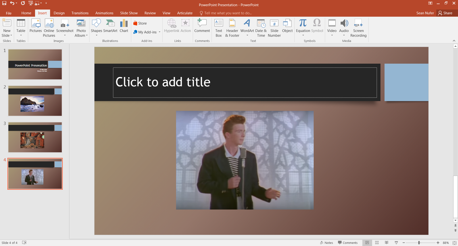
When you save your PowerPoint slides, by default it will save as a presentation file.  The file extension is .pptx.  So if you save your PowerPoint with the name Module 3 Overview, that file becomes Module 3 Overview.pptx.  If you share your pptx file with a colleague or student, then when they open the file they will be able to access the platform editor.  They can modify, add, and delete content - such as slides, notes, text, or images.  

 
PowerPoint editor mode

PowerPoint editor mode


The pptx files are editable formats, and good for sharing with people who need to collaborate on a project.  The downside is that when it is time to present the presentation, opening the file pulls up the editor for all to view (see above).  Since you don't present from the editor view, an additional step is required to actually begin the slideshow - you press F5 or click on the slideshow icon.  

PowerPoint Show

When a PowerPoint is saved as a Show instead of a Presentation, then the file opens in slideshow mode.  This completely bypasses the editor view and allows you to jump right into the presentation.  This adds a touch of professionalism when presenting in a class, at a conference, in a department meeting, or to a board of directors.  When you open a PowerPoint Show file, it automatically loads the title slide so that you can rock and roll without wasting time and without your audience seeing the cluttered editor.  

2018-03-02_11-41-09.gif
 

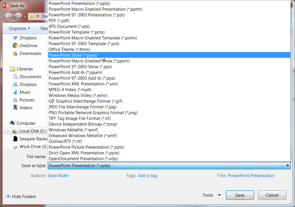
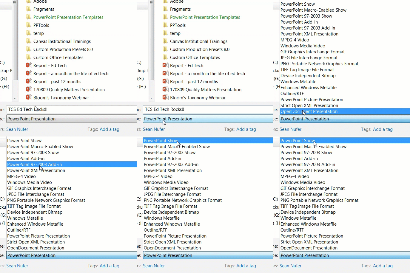
To save a PowerPoint file as a show, you click Save As and identify the location on your computer or cloud, and then click on the Save as type dropdown menu.  You will see a plethora of options, and you will select the one called PowerPoint Show (*.ppsx). 


Interesting side note, the * in that file extension is computer UI code for "anything".  If you have a large folder and you want to search for all the documents, then you would run a search for *.docx.  You can search for PDF files (*.PDF) or images (*.png or *.jpg).  

It is good to save both a pptx and a ppsx file, but in reality the two files are the same.  The only thing that changes is that the show opens the file in show mode, and the presentation opens the file in editor mode.  You can manually rename the extensions from .ppsx to .pptx or the other way around.  

Saving the file in show mode also has the added benefit if you want to share your slides with someone, but you only want them to see the content and not your notes, or you don't want them to make any edits.  You can either save the slides in show mode, or simply save it as a PDF (from the same dropdown menu above).  

Extra Curricular

If you save your file as a .ppsx show then there are a couple ways you can still edit it.  In PowerPoint, you can click File  >>  Open, and search for the file.  It will open like a .pptx file.  Or you can right click (PC) the file icon and select Open with and choose PowerPoint.

ppts edit.png
 

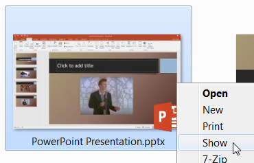
Alternately, you can start a PowerPoint presentation in show mode and bypass the editor by right clicking and select Show.  When you reach the end of the presentation, the show will end and the screen will go back to your desktop and not the editor view.  That way the audience won't see your notes at the end. 

pptx show.png
 

Just a tip, it would be good to include a Question or conclusive end slide.  This will help you wrap up the presentation and will be an indicator for you that says "don't progress past me".  

Written by Dr. Sean Nufer, Director of Ed Tech for TCS Education System.

A new way to embed content into Canvas

Previously on this blog, I wrote a post about How to embed content into Canvas in 3 easy steps.  Embedding content is a fantastic way to spruce up a content page, assignment, or announcement in Canvas by bringing in content from around the web and placing it in your class.  You can embed YouTube videos, presentations, or any of the tools that we showcase in our Technology Spotlight.  

In my previous post I explained that in 3 easy steps you can embed content, but I wanted to post an update and let you know that it is now even easier to embed content.  Canvas has an updated feature that allows you to embed without having to access the html editor (which, admittedly, can be quite intimidating to people who do not regularly come across html code).  Here are the modified steps:

Step 1: Grab the embed code

Embed code link.png

When you want to embed content from a source, you typically look for some sort of Share option.  Usually the Share option will have a popup or menu where you will find embed code.  The universal sign for embed code is:  </>

Look for that sign (or something similar) and copy the code provided.

embed+code+-+padlet+(1)[1].gif
 

Step 2: Paste your embed code

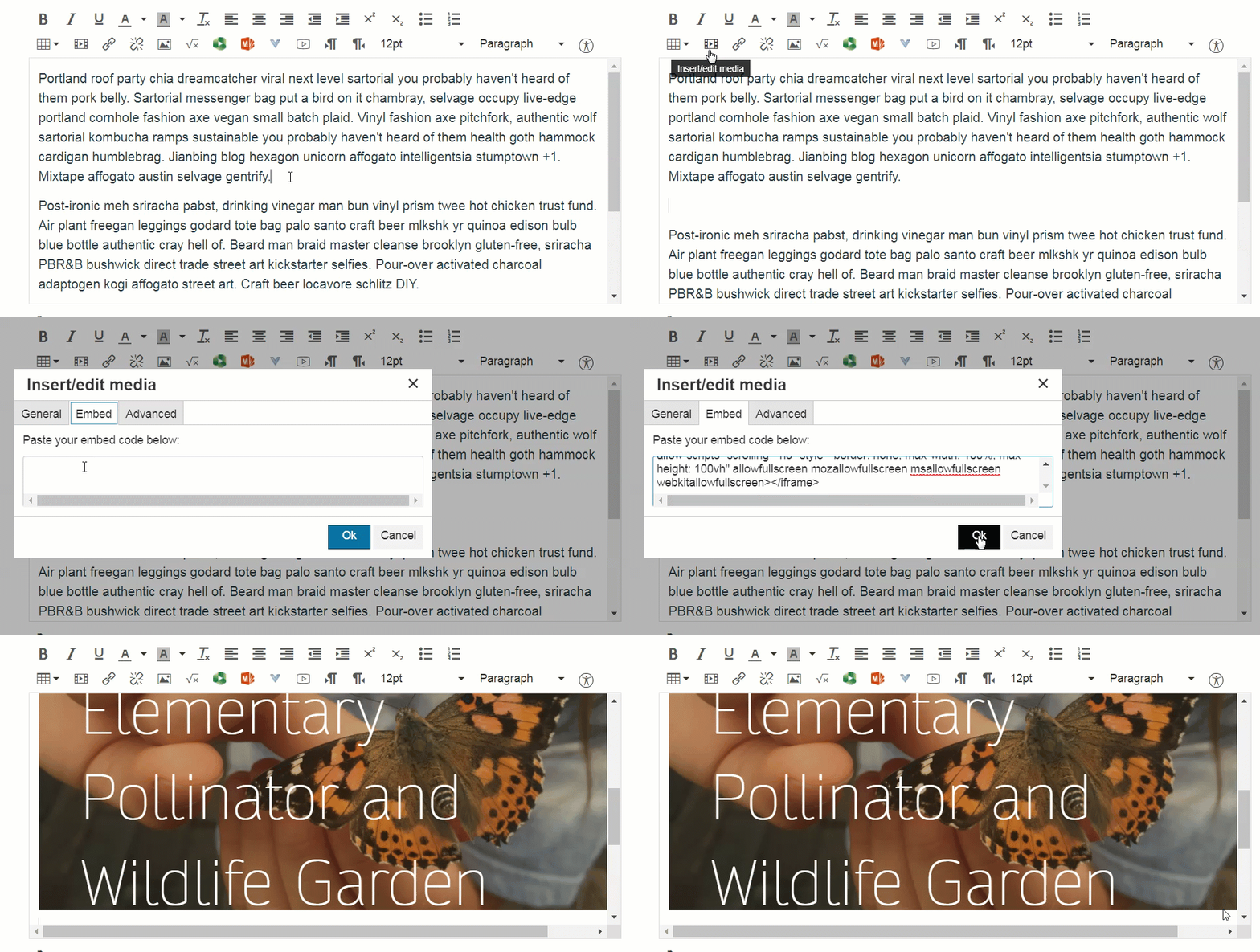
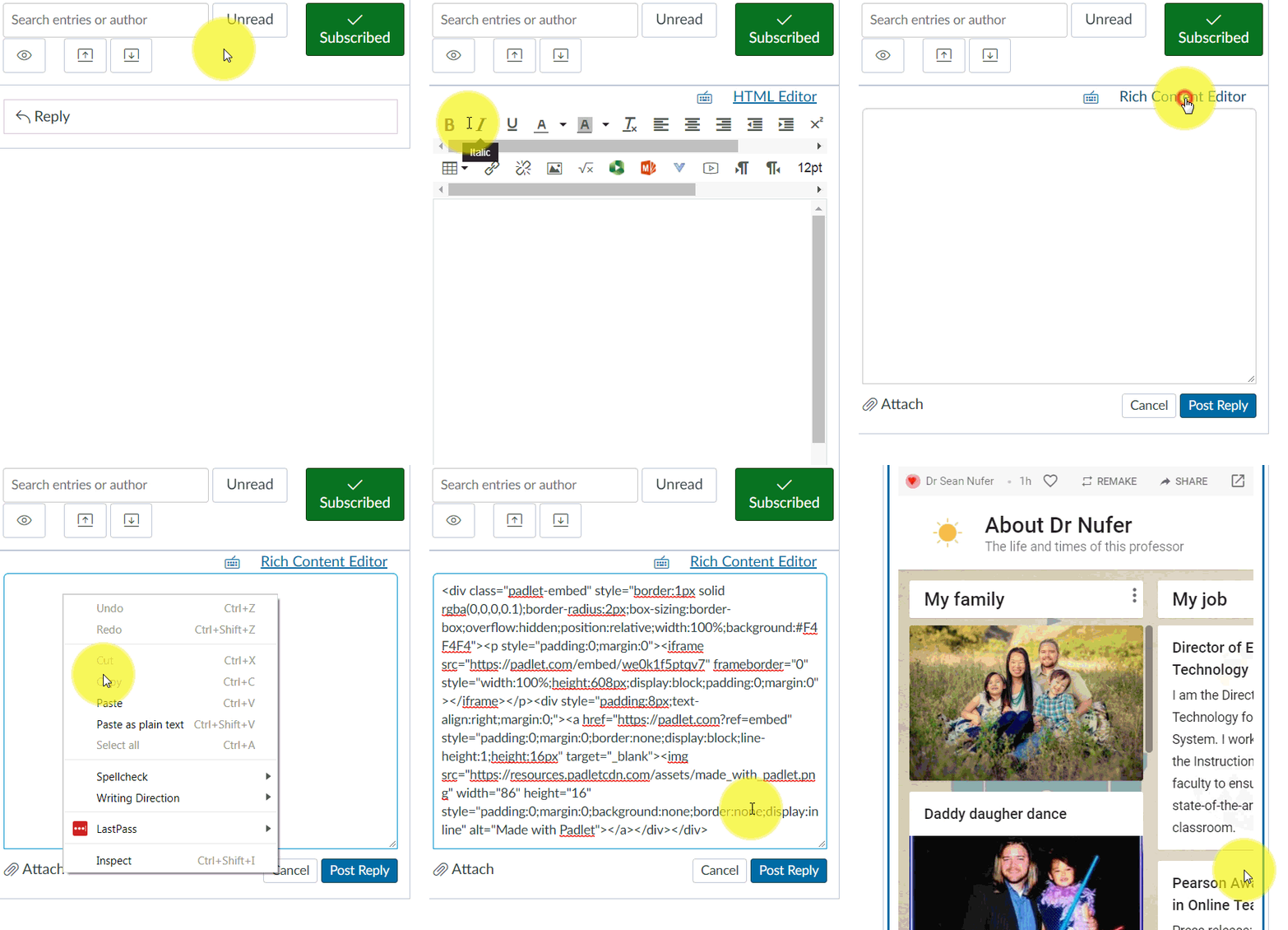
I made a promise to you.  I promised that it would not be easier to put your embed code into Canvas, and that you wouldn't have to mess with the html editor.  The trick to embedding content now is to place your cursor on the place where you want the embedded content to reside, then click Insert/edit media on the Rich Content Editor, and paste your code on the embed tab.  You will see a placeholder on the editing page, and when you save the page then your content will be embedded.  

 
embed.gif
 

Written by Dr. Sean Nufer, Director of Ed Tech for TCS Education System.

Technology Spotlight: Poll Everywhere

tl;dr - Even if you are already familiar with the Poll Everywhere platform, they have recently added a lot more fucntionality

Poll Everywhere at a glance

Poll Everywhere is an online platform that allows teachers or students to create a variety of polls and surveys.  Respondents can participate through computers, web-enabled devices, or through texting.  The responses are then displayed in real time in PowerPoint or Keynote, or in a web browser.  

HUH2q0oxvz[1].gif

The concept of a online polling is not in itself innovative, and  Poll Everywhere is not new.  However, their developers have made some fantastic improvements this last year, and even if you are already familiar with the platform I would invite you to revisit your account and check out all the new features.  

How can I use Poll Everywhere in my class?

The poll and survey questions can be exported as slides and imported into a PowerPoint presentation, allowing teachers to break from their presentation routine in order to engage students and solicit their real-time feedback.  Students can share their responses anonymously if they choose, and it allows each student to have an equal voice in expressing their feedback.  Introverts and extroverts contribute to the activity as equals.  In addition to the standard multiple choice poll questions, teachers can gather responses in a word cloud, or they could have students rank order items or complete open-ended questions.  Teachers can set up clickable images, where students drop a pin on an image.  I use that to ask my students to identify where they are from.  

polls.png

In addition to these standard poll items, teachers create surveys.  A survey can consist of a combination of various other poll items.  I can create a survey with a multiple choice question, a rank order activity, another multiple choice question, and a clickable image.  There are many more activities in  Poll Everywhere.  Many of these are very new:

  • Numeric scale
  • Icebreaker
  • Upvote
  • Leaderboard
  • Emotional scale
  • Self-paced quiz
  • News ticker
  • Retrospective
  • Assign teams
  • Discussion
  • Brainstorm
  • Priority ranking
  • Select on map
  • Short answer
  • Bulletin board
  • 2x2 matrix

Here is what I like best about Poll Everywhere 

I like that with  Poll Everywhere I can leverage technologies in the class without having to teach the technology.  Students can text their answers, download an app, or log into a web browser.  They can participate on their phones or computers.  I have never had a student who was confused by the instructions.  And the results are real-time.  It is an engaging way to interact with students.  Teachers can also use  Poll Everywhere to check for comprehension or guide the direction of the curriculum.  You can give students options about discussion topics, and this can be very empowering and engaging. 

Here is what I dislike about Poll Everywhere 

Like most platforms these days, Poll Everywhere is free for teachers, but there are various subscriptions for those who want more features.  I have been using my free account for about 7 years as of this writing.  With the free account, I am limited to 25 responses per poll, I don't get reporting, and cannot choose my username or add branding.  I don't get summary reports and I cannot archive results.  Finally, my support options are limited.  I am still happy with my free account, but I do get envious of the premium accounts.  

My recommendations

Poll Everywhere is a fantastic option for both online and traditional professors to interact with and empower their students.  It is fun for students to submit responses and see the live results.  I strongly recommend signing up for an account and trying it out with some low-stakes polling activities.  If you haven't visited recently then it's time to log back in and explore all the new features that have been added.  Share your fun activities and ideas in the comments.


Written by Dr. Sean Nufer, Director of Ed Tech for TCS Education System.

Basic Course Design

“… education, as now conceived, leads to demonstrable changes in student behaviors, changes that can be assessed using agreed-upon standards. “
—  David T. Conley

Instructional design is a systematic process in which educational content is created, organized, and subsequently made available to learners. Information is ideally presented in such a way that the learner is motivated to acquire the knowledge or skills being taught by the instructor. The purpose of this post is to shed some light on the first steps of the course design process.

One of the rudimentary concepts in education is the notion of delivering learning content through a series of “chunks”. The theory of the magic number seven, plus or minus two is more than half a century old, yet George Miller’s original publication remains one of the most cited papers in psychological journals. This theory can be readily applied to the delivery of educational content in an academic setting. The course structure within Canvas closely follows Miller’s chunking guidelines. ELearning expert, Tom Kuhlmann, once mentioned on his educational blog that even the most complex educational courses have similar structures when you break them down:

  • Welcome: some sort of title screen that welcomes the learner
  • Introduction: information about the course and its purpose
  • Instructions: review of the interface and how to navigate the course
  • Objectives: learning objectives and reason for taking the course
  • Section screens: this is the area that holds the core content. Each section can have its own welcome, instructions, content, assessment, and summary
  • Assessment: process to review overall understanding
  • Summary: summary of course objectives
  • Resources: additional content and resources that augment the course and support ongoing learning
  • Exit: next steps and see you later alligator

Within Canvas, some of these elements will be housed within the “course home” section of the Modules page, while the primary learning content will be accessible within the individual units. Graphically, the course structure appears as follows:

Basic-course-structure[1].jpg

When you break down the course even further to its very core components, the most important elements in instruction process are:

  1. The objectives
  2. The educational content
  3. The assessments
Basic-course-design[1].jpg
 

Often, most or all of the focus of course development is centered on creating and organizing the instructional content. Indeed, this proportionately represents the largest quantity of material in a course. However, it is important to realize that a course is only as valuable as its learning objectives and assessments. Without good objectives, it is not possible to accurately assess the content, much less the value of the course itself. Similarly, without good assessments it is not possible to know if students really know if the students benefited from the instructional content — as delineated through the learning objectives.

Thus the relationship between the learning objectives and the assessments which accompany the objectives is an instructional design marriage (with the offspring hypothetically being the actual instructional content). The objectives state what the students will learn and the assessments evaluate the extent which the students learned the material. Thus from a psychometric standpoint, it is essential that the assessments be:

  1. Specific
  2. Measurable
  3. Related directly to a learning objective

Good instructional design would not settle for even two of the three assessment essentials. Likewise, learning objectives must be written in such a way that they can be evaluated directly by an assessment (which is both specific and measurable). Thus, for students the most important “chunks” of information within a course will be found in the actual content within each unit or module (and optimistically the units will aggregate up into higher-level chunks), while the most important chunks for instructional designers are the objectives, educational content, and assessments within each unit or module. Granted, this may be an oversimplification of a rather complex system, but the logic behind this notion is one of the tenants of instructional design.

In some of the upcoming posts, we will further discuss how to write effective learning objectives, as well as how to recognize objective that require further refinement in order to be effective.

Written by Dr. Sean Nufer, Director of Ed Tech for TCS Education System.

Create an Interactive Branching Scenario in PowerPoint

What is a branching scenario?

slides.jpg

In this blog post, we will discover the basics of how to create a branching scenario in PowerPoint.  Typically, PowerPoint is known for advancing a slide deck forward or backward, similar to the old carousels for the slide projectors.  But in a branching scenario, what we want is the ability to navigate around - not just linearly (i.e. advancing the slide forward to the next slide or regressing back to the previous slide). 

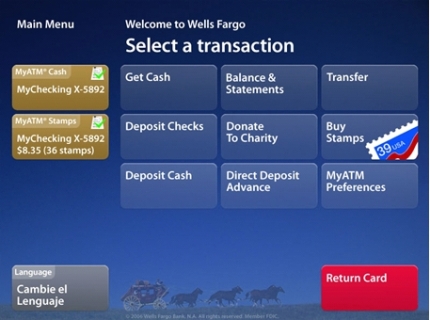
An example of an oft-used branching scenario would be an ATM menu.  When you swipe your card in the ATM, you are presented with a menu of items.  The next screen that displays is entirely dependent on the selection that you make on the initial screen.  You can check your balance, make a withdrawal, deposit money, etc.  You don’t simply hit next a number of times until you land on the screen you want.  The ATM navigation is branching and not linear. 

 
ATM interface.jpg
 

When we discuss branching scenarios, we first begin with a storyboard to chart the navigation of the user.  In the above example of the ATM interface, there is likely a splash screen of sorts.  This is the screen that displays as you approach the kiosk, and it usually says something such as "Welcome" and "Please swipe your card [or touch the screen] to begin".  The image above is the main menu screen - a jumping off point for the user.  A number of scenarios may play out next depending on the option that the user chooses.  

Another example of a branching scenario might be a concierge kiosk at a hotel.  This could be a self-guided kiosk that displays commonly requested inquiries.  The scenarios can be mapped out in a hierarchical branching format.  Here is an example of what that might look like:

 
branching scenario.png
 

Here we have a splash screen to welcome the user.  It likely says "touch anywhere to begin".  The user then advances to the second level, which is a main menu with options to discover information about Rooms, Amenities, or Local Attractions.  If the user selects the latter then s/he will be able to read about the attractions of the area, and a back or home button will take him or her back up to the main menu.  Choosing the amenities option will take the user to an overview of hotel amenities, with options to further explore the concierge desk or dining options.  This hotel happens to have many dining options, so from the main dining page s/he can check out the food court page or research the more formal dining options.  At this point, the restaurant page is level 5, because the user advanced as follows: splash/intro -> main menu -> amenities -> dining options -> restaurants. 

On each of the pages from levels 3-5, there should be a main menu button that takes the user right back to level 2.  There are likely back buttons that will take the user up one level to the previous screen. The more levels you have in a branching scenario, the more complicated the storyboarding becomes.  Your content will dictate how many levels you need, and how many screens you will need on each level.  

Creating your branching scenario in PowerPoint

Now let's explore how you can create an interactive branching scenario in PowerPoint.  We'll assume that you already have your content prepared and mapped out into levels.  To demonstrate the principles of branching in PowerPoint, I'll start with a blank presentation and put 4 slides.  I will put color on slides 2-4.

blank presentation.png

Now I have a main menu, and three color slides.  The next step is to create buttons for the main menu.  A button can be any shape or picture.  Once you place your shape, simply right click and select Link (or the hotkey is to press Ctrl + K).  This will pull up a menu that will allow you to create a hyperlink for your shape (or picture).  A hyperlink is an interaction that occurs when the object is clicked on.  There are many hyperlink options in PowerPoint.  You can have the hyperlink open a webpage, email a recipient, or in our case we want the user to be taken to a specific slide in our presentation.  

For my branching scenario, I am going to create three buttons on my main menu.  I will choose a rounded rectangle, but you can choose whatever shape you want (e.g. a square, circle, arrow, etc.).  From the ribbon menu, click on the Insert ribbon, then click on the Shapes icon in the Illustrations group to see a dropdown menu of options.  Review the video below for details on how to create and hyperlink my navigation buttons.

The last thing I will include on my kiosk is a back button on each of the colored slides.  This will return them back up to the first slide.  To do this, I copied (Ctrl + C) the first (red) button on the first slide and pasted it (Ctrl + V) onto the second slide.  Since both the button and the slide were red, I changed the color to blue.  Then I changed the hyperlink (Ctrl + K) so that it linked back to the first slide.  Then I copied the button again and pasted it on the last two slides.  I changed the button on the last side from blue to red, since the slide color is blue. 

The last thing that I do when creating a branching scenario is to change the show type from "presented by a speaker" (default setting) to "browsed at a kiosk".  This disables all keyboard and mouse functionality other than clicking on a hyperlink.  Since the only hyperlinked elements are buttons, it forces my user to navigate through the branched scenario.  You can change the settings to kiosk mode by clicking the ribbon: Slide Show -> Set Up Slide Show -> Show type: Browsed at a kiosk (full screen).

 
kiosk mode.png
 

And now my work is done.  Instead of a typical PowerPoint presentation where you advance progressively, you know have an interactive kiosk with a branching scenario.  You can review the end result below:

Of course, this is a very simple demonstration of the branching process, but it shows the fundamental elements involved in storyboarding scenarios and creating unique paths for the user.  All you need to do now is add your creativity.  Below is a final example of what might be possible using a branching technique.  Click on the icons to the left of the screen.

Written by Dr. Sean Nufer, Director of Ed Tech for TCS Education System.
 

Avoid the sizzle, go for the steak

“…people can come up with statistics to prove anything… forfty percent of people know that.”
—  Homer Simpson

Perhaps one of the most relevant debates among higher education pedagogical theories involves discovering the holy grail of educational delivery methods. Many professionals refer to the meshing hypothesis as the most valid educational model. This theory states, in essence, that effective education depends on first identifying the innate learner preferences (i.e. does the learner prefer to receive auditory instruction, or is the learner more adept at acquiring knowledge through visual or kinesthetic/tactile methods?). The learner preference is then paired with a compatible delivery method so as to ensure optimal knowledge retention. Thus, according to the meshing hypothesis, the most effective method for presenting information to learners depends largely on the learners’ knowledge acquisition preferences and abilities.

Indeed, the meshing hypothesis fits nicely into a pedagogical schema that attempts to utilize a taxonomic system for creating instructional content. Unfortunately, there is little to no credible research that supports the statistical validity of the meshing hypothesis. Pashler, McDaniel, Rohrer and Bjork (2009), reported that “very few studies have even used an experimental methodology capable of testing the validity of learning styles applied to education. Moreover, of those that did use an appropriate method, several found results that flatly contradict the popular meshing hypothesis” (p. 105).

learning style NO.png
 

Learning-style approaches to education are enormously popular within the fields of academia and instructional design (more than 70 different learning styles have been proposed over the past several decades), yet lack all statistical and practical credibility when it comes down to effective learning. Curry (1990) further delineated the problems in the operationalization of learning style theory, emphasizing the following complications relating to the topic of learning styles:

  1. Confusion in definitions
  2. Weakness in reliability and validity of measurements
  3. Identification of relevant characteristics in learners and instructional settings

To many readers, graphs similar to the one below have become an almost ingrained reality in instructional design.

graph[1].jpg


The lack of a labeled y-axis aside, this graph seems to represent one of the great faux truths in education today. The graph itself is deceptively intuitive (e.g. research rarely conveniently falls cleanly into intervals of 10, 20, 30…). The truth is that nobody seems to be able to locate the original research from whence these values are derived. There is essentially no data to back up these numbers. This graph, and others like it, may have originated from Edgar Dale’s “Cone of Experience”, developed in 1946 (at the height of the visual education movement) and replicated in 1969. Note that Dale’s graph is void of any form of numerical values or implications of empirical support:

Dale’s Cone of Experience (Dale, 1969, p. 107)

Dale’s Cone of Experience (Dale, 1969, p. 107)

Essentially what we as professors and instructional designers are hoping for is a statistical interaction between a learning style and an instructional method. Unfortunately, such a statistical interaction will not be found in the educational research databases, assuming the research methodology is sound. What this means in terms of instructional design and course development is that we should eschew the popular approaches of learning styles, and ground ourselves in the fundamentals of learning theories: Behaviorism, Cognitivism, and Constructivism.  The American Psychological Society dedicated an entire issue of their flagship scientific publication to researching learning styles, and the conclusion is that from a research methodology standpoint it is not a sound theory.

The field of eLearning is concerned with utilizing technology to provide learning solutions to accommodate the aforementioned learning theories (see: www.learning-theories.com). Such solutions may include:

  • online interactivity
  • videos/observation
  • simulation or scenario-based learning
  • screencasts
  • just-in-time tools
  • mobile interfacing
  • hands-on exercises
  • problems solving and critical thinking
  • mindmapping
  • group collaborative projects
  • interactive discussion boards
  • game based learning
  • multimedia
  • etc.

An excellent TED talk explains not only the myth of learning theories and the fallacies of the meshing hypothesis, but also the dangers of categorization from learner, instructor, and pedagogical standpoints.  In reality, the content of the material being taught should dictate whether content is being presented in a tactile, auditory, or visual manner - not whether or not a learner thinks that s/he has an innate personal preference for receiving instruction.  


In short, it is important to not underestimate the value of readings or lecture-based delivery (whether in a classroom or virtual setting), just as instructors should not rely entirely on experiential learning or discussion groups. Although the concept of learning styles was created with the best interest of students in mind, it would appear that research does not support the claim that students learn differently one from another. In other words, an “auditory learner” can learn a great deal from a hands-on exercise, and a “visual learner” can learn from both worksheet exercises and lectures-just as well as other students. Thus, effective pedagogy should cater to learning theories and focus on providing a variety of delivery methods, as opposed to attempting to distinguish among particular learning styles.

Written by Sean Nufer PsyD, eLearning Specialist for TCS Education System.

Sources

Curry, L. (1990). One critique of the research on learning styles. Educational Leadership, 48, 50–56.

Dale, E. (1946, 1954, 1969). Audio-visual methods in teaching. New York: Dryden.

Pashler, H., McDaniel, M., Rohrer D., & Bjork, R. (2009). Learning Styles: Concepts and Evidence. Psychological Science in the Public Interest, 9, 105–119.

Rogowsky, B. A., Calhoun, B. M., & Tallal, P. (2014). Matching learning style to instructional method: Effects on comprehension. Journal of Educational Psychology, 107, 64–78. 

What is badging?

Badging is a concept that has been utilized in the classroom for a few years now.  Perhaps you remember your childhood when a teacher would reward you with a sticker, or your piano teacher would stamp your chart when you memorized a song.  These reward systems are a form of microcredentialing that can help to motivate adult learners.  

In a badging scenario, a learner will complete certain criteria.  These benchmarks might consist of earning certain marks on a quiz or assignment, attending a class, passing a review, or completing other similar activities.  In the digital realm, the person granting the badge will track certain metadata, which will include the issuer's credentials and name, the recipient's email or other identifying information, a short description of the badge, a link to the criteria, and any other relevant data about the badge.  The badge can then be pushed out into a "backpack", or a portfolio-style platform where badges are housed.  This might be an institutional platform, or it could be an established external platform such as LinkedIn or Mozilla Backpack. 

What do badges look like?

Badges take many forms.  They will typically include a title, possibly a date, and relevant iconology.  The design should not be overly complex.  A few examples of badging sets found online include:

 
badges[1].png
 
tumblr_mdv1aixDVM1rvkpqxo1_1280[1].png
 
badges[1].jpg
 

The badges will appear as icons on the webpage, and may be granted to individuals, teams, or even an institution.  Completion of the badge indicates an accomplishment such as mastery of a skill, completion of a project, or recognizing a notable experience.  

badge details.png

How can I make or design a badge?

There are many different platforms that you can use to create a digital badge design.  If you happen to have Photoshop or are comfortable with designing images in PowerPoint, then you can save an upload images using those platforms.  Gimp is a good (free) alternative to Photoshop.  But if you are looking for good lightweight resources that let you design online, consider the following:

How can I earn/give a badge?  

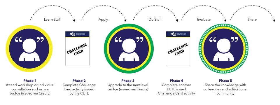
Badging strategies require a lot of work up front.  The issuer must come up with formal documentation delineating the criteria for the badge while identifying relevant knowledge, skills, abilities, and/or behaviors to be assessed.  The evidence for these criteria must be detailed, such as the appropriate learning pathways and benchmarks.  For a good description of these processes and competencies, refer to the blog post: How to Design a Digital Badge Strategy.  An example of the general process can be seen as:

How do I begin?

If you are ready to venture into the world of badging in your course, you might consider the following platforms:

A great resource within the Canvas Community can be found at: Badging Platforms for Canvas 

Considerations

If you are interested in researching whether badging would be a good tool for your classroom, consider the following points:

  • Badges should be meaningful - if everyone creates a badge for everything, then the concept of badging would be meaningless.  When everything you do is special, then nothing is special.
  • Badging page - It would be good to have a badging page with relevant links and requirements (think: curriculum and outcome alignment).  You can link the badge to a credible repository of outcomes.
  • Badging community - Badges from one institution or department might not be meaningful at another institution unless there is a common community.
  • Marketing - A good badging initiative would need marketing.  This might be a professor marketing to a class, or an internal institutional campaign with a formal PR campaign.  Get buy in and establish validity.  
  • Progression - It is common for badges to become progressively more meaningful.  Some people start with stamps, which turn into badges, which become shields (the nomenclature can change based on the strategy that the issuer creates).  This progression could reward behaviors that accumulate to demonstrate competencies, and competencies that accumulate to demonstrate completion.  
  • Establish intrinsic motivation - Badges aren't about just "showing up", but about demonstrating competencies.  You might create a class portfolio and establish leaderboards and showcase newly earned badges.
  • Design - It would be great to utilize a graphic designer.  If that is not an option then use one of the platforms listed above and remember to make the design simple with iconology that looks good with limited real estate.  Ideally your badge will be 150px by 150px.  

Written by Dr. Sean Nufer, Director of Ed Tech for TCS Education System.

Technology Spotlight: Padlet

tl;dr - Padlet lets you curate and creatively present content for your online classroom

Padlet at a glance

padlet_a_blank_wall_to_post[1].jpg

The concept of a digital bulletin board is not new - if anything it has nearly become banal.  Pinterest seems to dominate the market on curating pinned items.  However, in my opinion Padlet is a much more flexible platform for academia and online learning.  It embeds very cleanly (Pinterest requires a great amount of workaround to embed into Canvas), there are many options for customizing your layout and presentation, and it works very well for collaborative projects.  

Padlet allows you to add files, images, links, videos, etc. to a board that you can share with your class.  You can determine if the board is public, private, password protected, etc.  You can add specific users to collaborate or let them add themselves, and you can choose various moderator and contributor roles and responsibilities.

How can I use Padlet in my class?

I have used Padlet a few times in my classes.  It is a great tool for students to curate their own content and organize their online resources.  I also have used it as a class introduction tool.  I gave my students instructions on how to create a Padlet account, upload materials, grab the embed code, and embed their padlets into discussion posts.  Students didn't just link to their padlets - they actually embedded them into the post.  This made the discussion interactive, engaging, personal, and incredibly fun. 

In a typical "Introduce Yourself" discussion, I might see one or two posts per students.  In a class of 15 students, if I see 50 posts then I am amazed at their level of engagement.  The first time I introduced Padlet as a platform for the discussion, the students absolutely loved it and the participation was off the chart.  I gathered 300+ responses that week just in the introduction discussion - a number I had never seen.  Here was my personal introduction board that I shared with the class:

Made with Padlet

I also created an assignment where students were to gather sources based on the chapters in the textbook we read that week.  Each student had a dedicated spot on the Padlet where they gathered and curated relevant YouTube videos, blog posts, news articles, prominent tweets, and of course scholarly journal articles.  By Friday that week we had a well-build Padlet board that we all contributed to (yes, I even gave myself a spot on the board where I did research alongside the students and helped contribute to the class project), and their assignment over the weekend was to write a reflection paper based on our class Padlet board.  

Here is what I like best about Padlet

Padlet is incredibly interactive and there are so many possibilities to create collaborative assignments for the students.  I even embedded Padlet right into Canvas, so the students didn't have to go out to another platform to interact with it.  If I made a change on the website then it automatically changed the Padlet in Canvas, and vice versa.  I can't overemphasize how easy it is to embed - it can embed anywhere in Canvas where you have an HTML editor: announcements, assignment pages, discussion boards, content pages, etc.  The Padlet interface is intuitive and robust and it is easy to give access to the students.  Padlet works on any browser and on mobile, and even has apps for smartphones and tablets so you can build on the fly!

Here is what I dislike about Padlet

This is one of the rare platforms where I actually don't have a lot to criticize.  It is a free tool, but there are premium options available to allow branding, analytics, and tech support.  My only complaint is that I wish the embed code was less intimidating, perhaps using an <iframe> instead of a convoluted <div>.  But it's easy to figure out (reach out to me if you need help embedding).  

My recommendations

There are many applications for Padlet.  In addition to my examples as a class introduction tool and group project platform, you can:

  • use Padlet to build a community where students can share thought-provoking and interesting resources with each other
  • establish a virtual community or commons areas
  • use it as a tool for a professor to share content with the students
  • create a platform for experienced students to mentor new student
  • create an "idea bin" that students can contribute to throughout the term
  • establish a board that students can refer to during academic break
  • create challenge assignments where students build their own boards and then have a show-and-tell where they all come together
  • assigns groups to cover different themes of a topic
  • use this platform for book reports
  • brainstorm topics - individually, as groups, or as a class
  • have students use the platform as a journal or notebook - collecting images, ideas, videos, blog posts, online resources, etc.

In short, Padlet is a fantastic platform for collaborating on projects, organizing and editing content, and sharing sources in a fun, interactive, and easy setting that integrates into Canvas.


Written by Dr. Sean Nufer, Director of Ed Tech for TCS Education System.

Where to find amazing pictures for your class content

Imagery can be an effective design tool as you create and present your course content.  Good imagery not only adds good aesthetic elements, but can influence emotion, aid in recollection, and improve comprehension.  Imagery can help to capture and hold attention.  

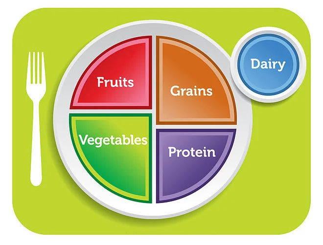
Consider the two examples below.  On the left is a description of the MyPlate nutritional model.  On the right is the diagram.  Choosing between the text on the left and the imagery on the right, ask yourself: which element captures and holds my attention, how much quickly am I able to comprehend the main points of the image vs. the main points of the text, and which will likely be more effective in helping me recall those main points?


What to Put on Your Plate

Eating the MyPlate way means filling half your plate with vegetables and fruits, adding slightly more veggies than fruits.

Go for a colorful mix. You'll get plenty of nutrients that way.

You should fill the other half of your plate with lean protein and grains, using slightly more grain than protein.

Good sources of protein include:

  • Lean cuts of beef, pork, lamb, and other meats
  • Fish and shellfish
  • Beans and peas
  • Tofu and other soy products
  • Chicken, turkey, and other poultry
  • Eggs
  • Nuts and seeds (use sparingly)

Whole grains should make up at least half of your grains. That means choosing brown rice instead of white rice, for instance.

The MyPlate icon also shows a glass of milk near your "plate." It's a reminder to include dairy (mostly fat-free or low-fat) in your diet. Calcium-fortified soy milk also counts.

myplate.jpg

Now, of course the narrative text contains much more information and is vastly more comprehensive than the image.  But it is important to realize that we are not necessarily choosing between only one (text) or another (imagery) as we create and present our content.  In other words, imagery can be an incredibly effective supplement, as it is often the first thing people look at.

So the question is: where can I find good pictures that I can use in my course?  There are many good options.  Often, people initially search flickr, Wikimedia Commons, or FFCU (free for commercial use) for pictures.  These sites let you search for pictures that are free and you can do whatever you want with them.  You can also contribute to their repositories if you have photos that you have taken and would like to share them.  [for more information on Fair Use and copyright guidelines, review our webinar: https://www.youtube.com/watch?v=CwkFNs4R_FI]

There are many places where you can find good, profession, aesthetically appealing photography.  I am going to showcase my favorite platforms:

Pexels is a stock photography site with thousands of free professional pictures that you can download, modify, and use anywhere.  No attribution is required.  The resolution is very high quality and will look good on any device.  Pexels is my personal favorite site.

https://www.pexels.com/

Pixabay is another repository that is free with over 1 million images that you can download.  In addition to pictures, you can also find  videos, vectors, and illustrations.  Pixabay has a large international community of contributors.

https://pixabay.com/

MorgueFile puts a spin on this list because although it is free, you can also sign up for a paid account ($25/year) which will allow you to edit images with enhancements and filters, and create your own categories.  Paid accounts also remove advertisements.

https://morguefile.com/

Unsplash is also one of my favorite sites.  It has a very clean and intuitive interface, a good social media presence, and for Chrome users there is a fun browser extension that showcases a fresh image each time you open a new tab.  

https://unsplash.com/

Visit some of these sites today and start making your content look amazing and professional.  Remember to review our previous post on design layouts and aeshtetic tips and trick: https://www.tcsedtech.com/blog/2017/10/5/10-tips-for-making-your-powerpoint-slides-effective

Written by Dr. Sean Nufer, Director of Ed Tech for TCS Education System.

Top 9 Tips for Creating Engaging Webcam Videos

Lights. Camera. Action.

webcam.jpg

Position your camera at eye level

A good practice is to make sure your camera is placed at eye level, or even slightly above eye level.  What you want to avoid at all costs is looking down at a camera.  It is typically not the most flattering angle.  

Avoid backlighting

Backlighting occurs when there is a major source of light behind you, such as a window on a sunny day or a lamp.  The problem is that your camera will adjust to the light, which will make you appear as a dark, shadowy silhouette.  

Close all unnecessary programs

We want our picture to be clear as possible, and we want our camera presence to be free from distractions.  Close out your email and any other program that could either distract you with popups or compromise your computer's bandwidth.

Wear solid colors

Avoid stripes and patterns that may appear distracting to the viewer or which may complicate the picture.  Most high definition cameras will be able to handle stripes, but sometimes the transmission is affected by bottlenecks in the bandwidth or video compression.  The best practice is to go bold and solid with colors - or simply wear a white shirt.

Check your surroundings

A common theme in this list is to avoid distracting elements in your videos.  Do a scan of the room and make sure that there is no clutter in the background, or nothing that could distract your viewer from the most important part of the video - YOU!

Control ambient noise

Similar to checking your surroundings, you also want to make sure you have control over the sounds that will be picked up in the video.  Perhaps put a sign on your office door alerting people that you are recording.  If you are at home then see if someone can walk the dog and make sure the kids know to keep the noise down and that you will need some time without interruptions.  

Invest in a good external webcam and microphone

Most laptops come equipped with video and audio options these days, but with a little investment in decent equipment you can take your productions up several notches.  The most popular webcam on the market for the past many years is the Logitech C920.  Check with your department or IT to see if they have one for you.  Amazon typically offers affordable external microphones, such as the Samson Go Mic.  Mics can sit on the desk, but the closer you position it to you, the more clear and pronounced your audio will be.  

Maintain eye contact

When you are recording a video, you are making very individualized correspondence to each of your audience members.  If you are new to creating online video, it can be incredibly daunting - as you are essentially giving a performance to a tiny glass dot housed inside a small piece of plastic.  But know that this small inanimate dot represents the eyes of your audience.  Even though you will not be receiving feedback, know that your people are there.  Maintain direct "eye contact", and have confidence.

Length of video

If you are recording a video, consider that breviloquence is a virtue for online videos.  Consider scripting and chunking your content.  Long videos are rarely seen in their entirety, and you will get more viewership the shorter your video is.  A 2 minute video may gain more traction than a 4 minute video, and anything longer than 6 minute is likely not going to be effective.  If you have more than one main idea in your video then you should create more than one video.


Creating videos may be a daunting task, especially for those who are new to the endeavor.  However, they can be an incredibly helpful and effective way to engage with your audience and convey your message.  Videos can be a personable way to present content and communicate information.  Do not be intimidated.  Simply practice and work to improve little by little and soon you will become a webcam champion.  

Written by Dr. Sean Nufer, Director of Ed Tech for TCS Education System.
 

Basic HTML Tables

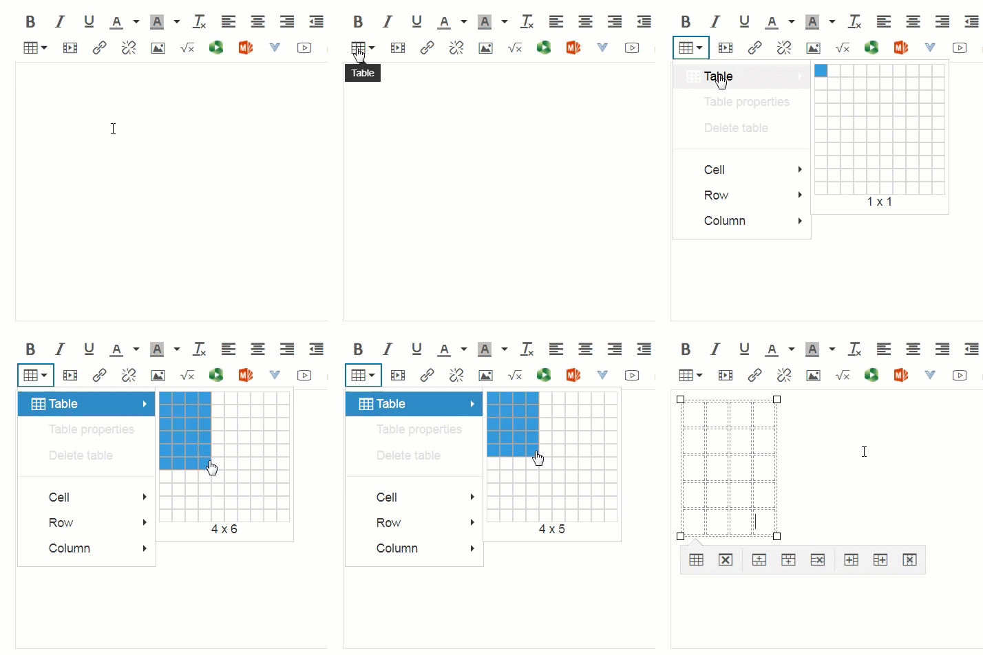
Today we are going to talk about tables.  There are many ways to put a table in Canvas, and there are many creative uses for tables on our content pages.  We'll begin with the very basics, which is how to insert, format, and modify a table using the Table Creator feature on the Canvas Rich Content Editor.  To do this, open the Table icon and click your cursor on the grid to determine your dimensions of the table.  After you have chosen your dimensions, you can still modify then on the content page.

 
How to create a table in the RCE.gif
 
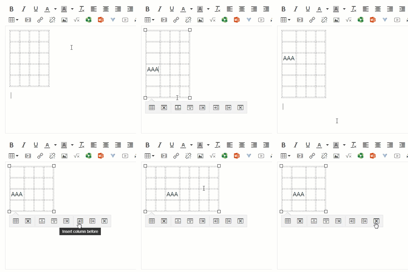
modifying a table.gif
 

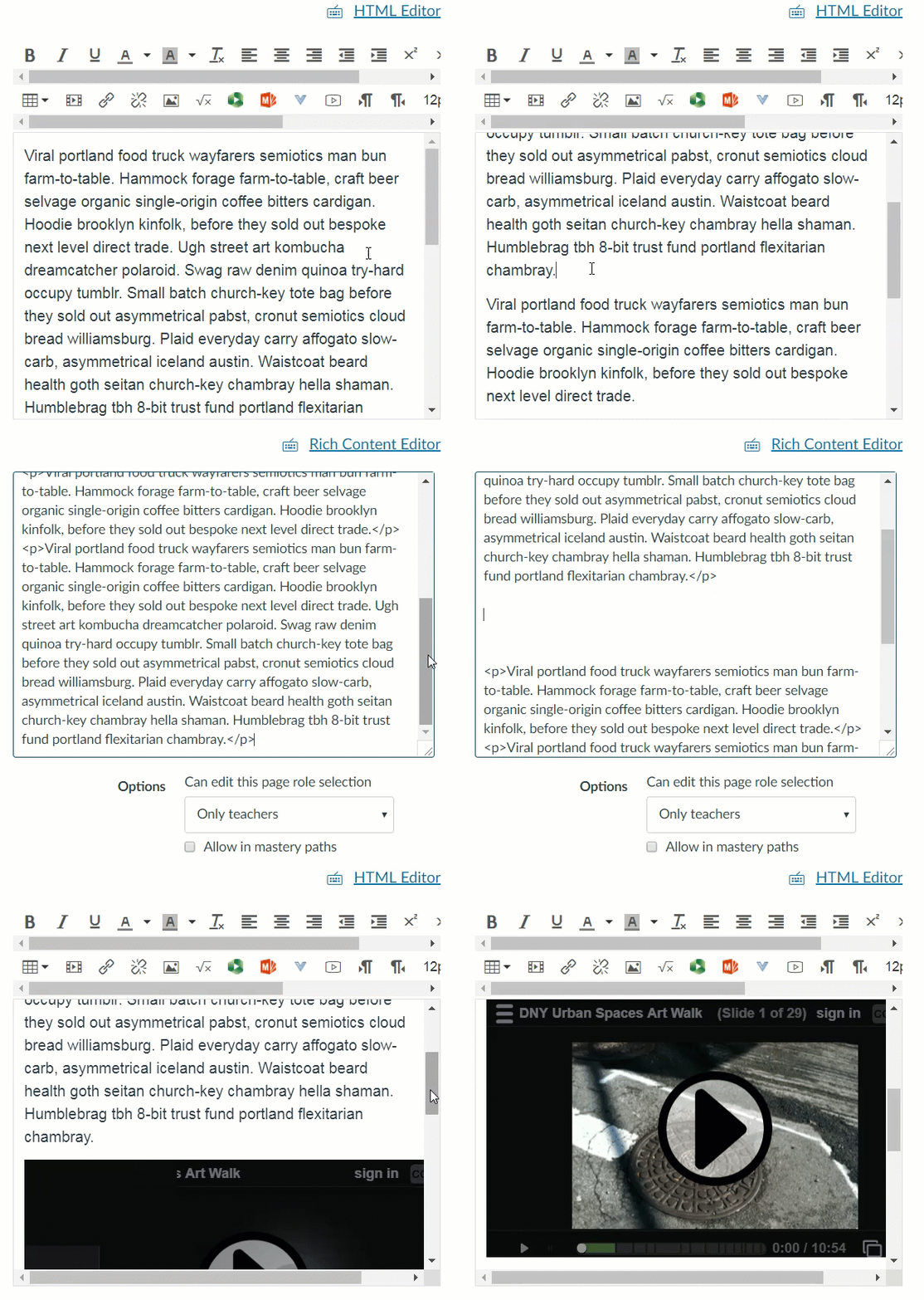
Once your table is created, you can use the table properties option to further edit the specifications.  To do this, place your mouse cursor anywhere on the table and select the Table properties option from the dropdown.

Below are the various options and general properties that you can adjust on your table.  You can learn more about tables in Canvas here: https://community.canvaslms.com/docs/DOC-12912-415241504.


General Properties

  • Width: The width of your table (in pixels or percent, e.g. 500px, 50%). Note that the table width may be adjusted manually by selecting the table until the adjustment handles appear around the perimeter of the table, then clicking and dragging the handles to adjust the size.    
  • Height: The height of your table (in pixels or percent, e.g. 500px, 50%). Note that the table height may be adjusted manually by selecting the table until the adjustment handles appear around the perimeter of the table, then clicking and dragging the handles to adjust the size.  
  • Cell Spacing: The space between individual cells as well as cells and table borders (in pixels, e.g. 3px). 
  • Cell Padding: The space between the cell border and its content (in pixels, e.g. 5px).   
  • Border: The thickness of your table border (in pixels, e.g. 5px).
  • Caption: The table label is displayed on top of the table.  
  • Alignment: The location of your table on the page.

Advanced Properties

  • Style: The style of your table. You can add custom CSS styling to your table such as colors, borders, spacing, and alignment.
  • Border Color: The color of your table border. You can either type in the hexadecimal RGB number for the color you want (in #nnnnnn format) or type in basic colors (red, pink, cyan, blue, green, yellow, brown, black, etc.)
  • Background Color: The color of your table background. You can either type in hexadecimal RGB number for the color you want (in #nnnnnn format), or type in basic colors (red, pink, cyan, blue, green, yellow, brown, black, etc.) 

HTML Tables

The Rich Content Editor is a great introduction to tables, but it only provides a fundamental structure for your table.  If you want to further customize unique aspects of your table, then you likely will benefit from exploring HTML.  In HTML format, the code for a basic table will require defining the start and end of a table <table>, as well as the table row <tr> and the individual cells <td> (table cells are called table definitions in HTML).  Below is the code for a 2x2 table.  Feel free to modify the content in the individual cells and click Run Code.  [tip: refresh the screen if you want to reset the table HTML content]

 
Code
Output


That code would give you a 2x2 table.  If you wanted to add another row, then add the following code below the second row in the code:

<tr>
<td>row 3, cell 1</td>
<td>row 3, cell 2</td>
</tr>

If you wanted to add another column, then you would add: <td>row X, cell 3</td> to each row (of course, replace the cell content with your own content).  Or in this case it would likely be easier to use the Rich Content Editor.  Below are several examples of what the HTML would looke like for various table dimensions.  Feel free to play with the code and modify the table dimensions through the code.  Note that on the last example, the border is set to 3 pixels.  Modify that value and see how it renders.  How does one pixel differ from 3 pixels, and what does a width of 15 pixels look like?  If you do not want any border, then either write it <table border="0"> or simply <table>. 

One column:

100

One row and three columns:

100 200 300

Two rows and three columns:

100 200 300
400 500 600

A basic note about html is that every time you open a tag, you must close it. So every <table> needs a </table>, and every <td> needs a closing </td>. Thus you need to keep track of all your <tr></tr>'s and <td></td>'s. 

Now to add a little more to the tables, it is really easy to include captions and headers. Headers are similar to putting <b>bold</b> within the cells, but is a more proper and much cleaner way to do so. You can assign any cell to be a header cell, but for continuity they are typically either vertically or horizontally aligned. Here are some examples of captions and headers:

Monthly savings
Month Savings
January $100
February $50


Balance Sheets
  Revenue Profit
First Quarter $100m $21m
Second Quarter $90m $17m
Third Quarter $95m $18m

Now suppose you want a cell that spans more than one column or more than one cell. You would define that within the cell by using the following tag: colspan="[the number of cells it should span]". A quick example below:

Cell that spans two columns:

Name Telephone
Professor Awesome cell: 555 77 854 office:555 77 855

Cell that spans two rows:

Name: Professor Awesome
Telephone: cell: 555 77 854
office:555 77 855

If you would like to include cell padding (which I almost always do), then you can include that information within the <table> tag. Cell padding is basically like putting space between the content of the cell and the border or wall of the cell. Some examples below:

Without cellpadding:

First Row
Second Row

With cellpadding:

First Row
Second Row

With lots of cellpadding:

First Row
Second Row

One final attribute I will cover in this blog post is defining widths and heights for tables or cells. There are two different ways to define the the attributes for the width or height. You can either specify pixels or percentages.  

Value Description
pixels Sets the width in pixels (example: width="50")
% Sets the width in percent of the surrounding element (example: width="50%")

In case you are wondering what the code for the above table looks like:

This may seem like a lot of information, but with a little dedication and practice, styling tables in HTML can be easy.  Many times the Rich Content Editor is sufficient, but learning the fundamentals of HTML will give you the freedom to customize your tables.  You can further empower your coding skills by researching online to find tips and advice.  Some good starting points would be:

https://www.w3schools.com/html/html_tables.asp
http://divtable.com/generator/
https://www.quackit.com/html/html_table_generator.cfm
http://www.rapidtables.com/web/tools/html-table-generator.htm
 

Written by Dr. Sean Nufer, Director of Ed Tech for TCS Education System.

Technology Spotlight: Thinglink

 
thinglink-logo[1].jpg
 

Tl;dr – Thinglink is a cross-platform tool for combining images with media and text.  

Thinglink at a glance

Do you remember those overhead projectors your teachers bored you with in the classroom? Thinglink is like that… plus about 20 years of design and technical advancements. Thinglink is a tool you can use to enhance visual media such as infographics, maps, photos, graphs and charts, videos and even 360 photos by adding interactive icons that can be expanded to display text, video, links, and other embedded content. Thinglink adds dimension, detail, and interactivity to otherwise simple or inexplicable images.

http://www.thinglink.com/edu

Thinglink offers several different pricing options but, for online classroom purposes, the free version is probably sufficient. There are, however, different educator pricing options that might be worth looking into.

The interface is simple and intuitive. Simply upload your image and add expandable tags where you can then add text and/or media.

How can I use Thinglink in my class?

Thinglink is an excellent solution for introducing new or complex topics or situations to your students. Sometimes images alone just can’t adequately convey the intended message or instructional content. Thinglink is a very effective tool at pointing out or expanding details. It can help educators call attention to critical points of information or expound on areas that may be unclear to the student.

Thinglink embeds well into canvas. You can use Thinglink to dramatically enhance engagement and interactivity in your Canvas courses, greatly improving content delivery and knowledge retention vs. flat traditional images. Thinglink also offers analytics and usage data so you can evaluate where your students are engaged or what areas they interact with the most.

What I like best about Thinglink

Thinglink is a very simple, intuitive platform yet it offers some innovative and powerful applications such as 360/VR integration. In the Premium Teacher paid version you can use Thinglink to immerse your students in a virtual environment. With VR becoming more accessible and mobile friendly, virtual learning environments in the classroom are now possible.

Check out these VR learning environments: 

What I dislike about Thinglink

Thinglink has its limitations. For one, even at premium prices, Thinglink projects are limited to a certain amount of students or viewers. I would be willing to pay per project to be able own, export, and manage my own creations without usage limitations, but to pay $120 every year for as long as I want to keep my usage needs is a hard expense to justify. I understand that a free service should be limited but paying upwards of $120 a year to be able to use 360/VR features or expand a student base to more than 150 seems excessive.

My recommendations

Give the free account a try. After exploring the platform and experimenting with some of your own Thinglink creations, you might discover some creative ways to enhance your online classroom. Once you create a few starter projects, over time, your projects can evolve into more complex presentations. If you find value in your presentations, check out some of the additional paid features.

Written by Thad Stott, Instructional Technologist, Department of Ed Tech for TCS Education System.

Technology Spotlight: H5P

tl;dr - H5P lets you create awesome content for your online classroom

H5P at a glance

H5P is an amazing open source HTML5 eLearning authoring tool.  Wait, did I lose you already?  All this web code is all so confusing, and you know what?  My degree was in psychology, not computers.  So let's make this simple.  If you would like to have some interesting and engaging interactions in your online classroom without having to worry about all that computer stuff then you should check out h5p.org.  It does the code stuff for you so that you can just focus on the content.  

You can create a free account and then start building interactions, games, presentations, flashcards, and many more awesome things.  They have a whole webpage that is a treasure trove full of examples and templates for you to explore: https://h5p.org/content-types-and-applications  To get you started, here is an example of an interactive video:

How can I use H5P in my class?

Your H5P interactions can be built and then placed within content pages in Canvas.  So any place where you have a Ruch Content Editor, such as a content page, a quiz question, a course announcement, etc., you can incorporate an H5P interaction.  So, for example, if you have a module overview page that you want to add some interesting content to, you can place a picture and put hotspots on it.  As students scroll over or click on certain areas of the picture, the content will interact with them.  Perhaps a definition will pop up or a video will play.  See the example on the right.

I could also create an interactive timeline or a memory game. I can organize a collage of images or embed a course presentation with interactive slides.  One of the interactions that I like is a sequential visual tool that allows the user to transition from one picture to the next.  It's an interaction called Agamotto (likely a nod to Dr Strange). You can explore the example below: 

Here is what I like best about H5P

A screenshot of an accordion menu that I was creating in H5P

A screenshot of an accordion menu that I was creating in H5P

For starters, H5P is open source and free.  People who are smart with web design and coding contribute to this platform and they make it incredibly easy for non-coders to use.  Everything is simple and fairly well explained.  They have installation guides to walk you through, and building out the content is easy.  Once you're ready to put it into your Canvas course, it's as simple as copy and paste.  This platform is great if you want to explore interactivity in your online classroom.  They have good documentation and an active community to support you.

Here is what I dislike about H5P

Do you happen to know a little about HTML?  If so then you might find this platform a little stifling.  What you gain in simplicity and ease, you sacrifice in customization and freedom.  This tool is really for a beginner audience.  Even so, you do have to know how to copy embed code and paste it into the HTML editor on your Canvas page.    That's a good amount of exploring and you may need to reach out to your instructional designer for help with that.  They have very good documentation for the Moodle LMS platform, and I wish Canvas support was more specific.

My recommendations

I say, go sign up for your free account and just begin exploring the examples and templates that they provide.  You can duplicate one of their examples and modify it, or if you have a good vision of what you want to create then start from scratch.  Start small and try to add to your collection over time.  There is a community available for you as well as a forum, if you want to reach out to other users.  This is a low-stakes high-reward platform, and I say: Go explore!

Written by Dr. Sean Nufer, Director of Ed Tech for TCS Education System.