Keep things short and to the point
The PowerPoint platform is meant to be a tool for presentations, but it is really a supplement and should not be a crutch. Whether you are using PowerPoint as part of a formal presentation or as a standalone resource for your audience, it is important to keep your talking points streamlined and efficient. Excessive narrative belongs in PDF report format, not within a slidedeck. Do not write paragraphs on your slides. Even if you use bullet points, you want to make sure they are shortened and to the point.
Choose the right font and formatting
Again, the theme is to keep it simple. There are many options for font families, but it is important to pick the right font. The right fond is the one that the audience will read.
Sans-serif font are not ornamented (the serifs are the elements that "dangle" off the letters) and facilitate readability. Decorative and script fonts should be used very sparingly, perhaps only as slide titles and only if they are easily legible.
- The wrong font can be nearly impossible to read. Arial, Verdana, Helvetica, and Calibri are always safe choices and they are available on most computers.
- Be generous with the font size. These days our PowerPoint slides may be read on anything from a high-definition projector to a mobile device, and everything in between. A good rule of thumb is that slide titles should be no smaller than 20pt, while the slide body should be at least 18pt.
- If you are aligning your text, use either left align or right align. Center aligned text is the most difficult to read and does not look polished or professional.
Contrast: A designer's best friend
The principle of contrast is all about accentuating differences. We are conditioned to notice differences and we appreciate contrast. In literature and cinema, we find struggles between contrasting characters to be particularly compelling: Darth Vader vs. Luke Skywalker, or Harry Potter vs. the dark Lord Voldemort. We may not be conscious about it, but we are always searching for differences in our environment. Contrast in our PowerPoint presentations can give our design energy and authority.
For this reason, the background images that we choose are exceedingly important. Avoid noisy or gradient backgrounds (graphics that morph and blend from dark to light shades). Your background should be very dark or very light, and your font color should complement that. Remember, light text on a dark background, and dark text on a light background.
Examples of bad slide background images. On the left, despite the good contrast between the dark font and the light imagery, the scene is much too busy and visually distracting. On the right, the background is gradient and the dark font on the dark background does not provide good contrast (especially if this were presented on a VGA projector).
Although still a little busy, the example on the left ensures that the text is legible by cropping the picture and presenting the title as black font on a white background. There is not simply one singular design layout, but the slide on the right is an example of a possible layout that ensures that the font is legible.
Do you have data? Show it!
We have evolved to be visual communicators. Our neanderthal ancestors communicated visually via cave paintings as a way to record events, preserve their genealogy, tell stories, and document history. Even today, we have an appreciation for visual communication. You may even find that it is more efficient for you to communicate through visual elements than it is using text - although it does take practice. PowerPoint has many graphic and design options to choose from. If you are interested in reading more about effective graphic design, you might consider these readings:
Transitions
PowerPoint has some very interesting and lovely transitions. There are exciting fractal transitions, dissolving checkerboards, page curls, and origamis. My advice is that you shouldn't use any of these transitions. If you do feel like you need transitions, be sparing and subtle, and limit the different types of transitions you use in a presentation. If a particular transition serves the content of the two slides and you feel it is appropriate, then please use it. Otherwise you want to avoid the flashiness and stick with a classic transition, such as fade. With that said, the morph transition is actually a very interesting tool. You can see this transaction in action below:
Use Imagery
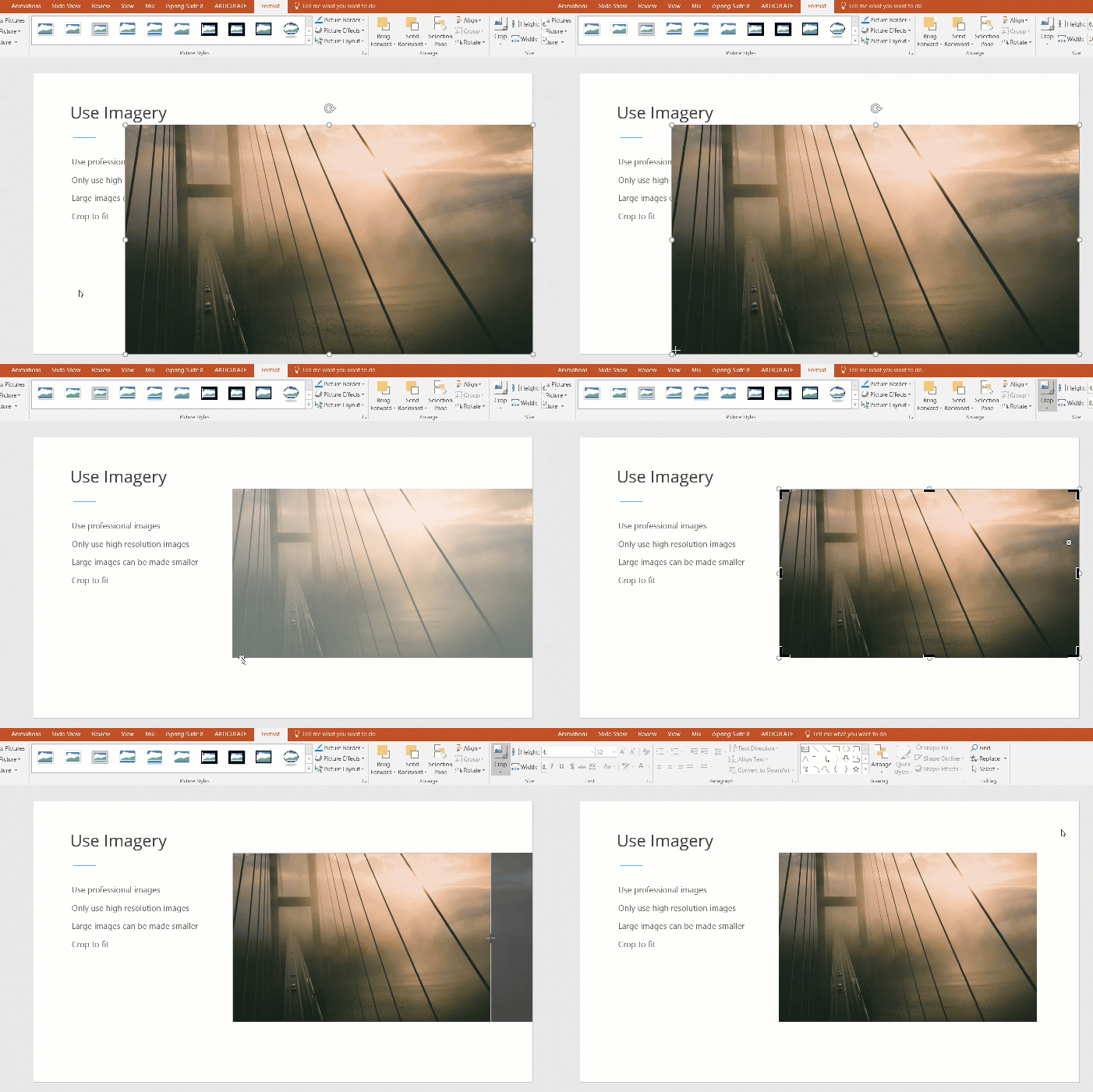
In addition to graphs and charts, imagery can greatly impact your PowerPoint slides. Be mindful of copyright law, but know that there are many great resources available for you that provide professional, high resolution images. Some of these sites include: pexels.com, pixabay.com, flickr, or morguefil.com. The reason why you want high resolution images is that you can always take a large image and make it smaller, but you can't make a small picture larger. If you enlarge a small image then you will end up losing quality, as it will appear grainy and pixelated. If you need to make sure an image fits within a certain dimension, crop is or drag it from the corner to resize; do not adjust only the width of the height or else you will end up with tall and skinny or short and fat images.
You also want to avoid many of Microsoft clichés, including clipart, bevel and 3-D effects, and many of the older SmartArt styles. Also, steer clear of sound effects (e.g. a whoosh sound that plays with a slide transition). Many of these older effects show signs of their age and audiences have grown weary of them.
Color Schemes
Color can add flash and flair to your presentation. It can bring ordinary content to life. You may be tethered to a certain departmental or institutional template, but if you have a little freedom to explore color schemes then make sure you are mindful of your audience and that you choose colors that work well with each other. PowerPoint actually has many very good color schemes built into the platform. You can find these on the Design ribbon >> Variants >> Colors (from the dropdown).
Another excellent resource for finding color schemes is a platform called Adobe Color. Within the app, you can explore color options and search for complementary colors, triads, and you can even upload a picture and create a color scheme based on its composition.
Housekeeping tip: Aligning objects
One key to having a polished and professional slidedeck is to make sure that your objects are properly aligned. What you shouldn't do is drag and drop each object and manually try to align everything. This will be a lot of work with a lot of room for error. The best way to align multiple objects is to:
- Hold shift while clicking each object to select all the objects.
- On the Format ribbon look for the Arrange group, then apply the Alignment Type
PowerPoint Presentation vs. PowerPoint Show
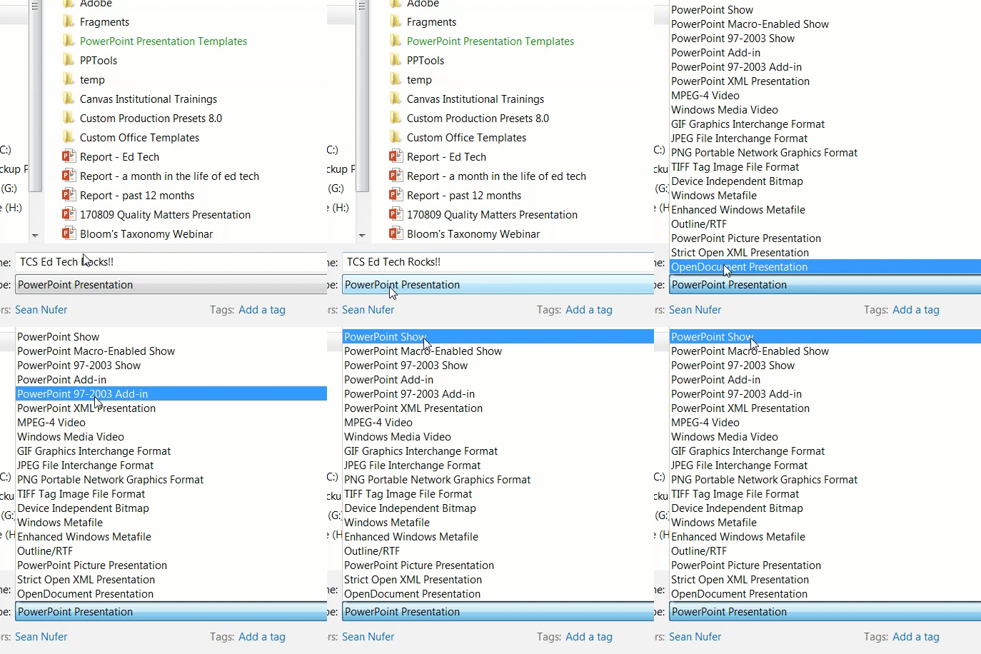
What is the difference between a pptx and a ppts file? One is a presentation file, and the other is a show file. Okay, so what in the world does that mean, exactly? When you open up a regular PowerPoint file (.pptx), then the PowerPoint program will load up, where you will see the editing pane with all the slide thumbnails and ribbon options. This allows you to create, modify, save, and show your content. However, if you are giving a presentation then you can jump straight to presentation mode by saving the file as a show (.ppts). This means that when you click on the file then it will obviate the editing mode and start the slideshow immediately. Saving a PowerPoint file as a show is as easy as File >> Save as... >> Save as type: PowerPoint Show.
Presenter View
Are you going to have two monitors when you present? If so then you qualify for Presenter View. Throw away those note cards, because with presenter view you can not only see your presentation slide, but you can also read the slide notes, see the upcoming slide, keep track of time, easily make annotations on the slides, and a myriad of other handy features. To enable the Presenter View, click on the Slide Show ribbon and check the Use Presenter View box in the Monitors group. In that group you can also select on which monitor the primary slide show will play. You can also set up the presentation by clicking on the Set Up Slide Show button in the Set Up group on the Slide Show ribbon.
Written by Dr. Sean Nufer, Director of Ed Tech for TCS Education System.


![what-is-an-infographic_50291a17367d7[1].jpg](https://images.squarespace-cdn.com/content/v1/59a6ece6d2b857a0be0ccba1/1507248304491-ZJ5NXL1W7IR5438KV42E/what-is-an-infographic_50291a17367d7%5B1%5D.jpg)


![48865a02-2643-4a88-a1e7-8b42776fcf91[1].png](https://images.squarespace-cdn.com/content/v1/59a6ece6d2b857a0be0ccba1/1507258336557-4D3SM1LB0WEN6BSPP6ZB/48865a02-2643-4a88-a1e7-8b42776fcf91%5B1%5D.png)
![1928497e-9333-4578-bc74-0f883cbe6852[1].png](https://images.squarespace-cdn.com/content/v1/59a6ece6d2b857a0be0ccba1/1507258500329-IQIBQMF21SSB5SAN8H95/1928497e-9333-4578-bc74-0f883cbe6852%5B1%5D.png)
![72b84f83-e3fd-420d-bab6-75592dc74f0a[1].png](https://images.squarespace-cdn.com/content/v1/59a6ece6d2b857a0be0ccba1/1507258520987-BHKUVWI0BAXD2LKNROQN/72b84f83-e3fd-420d-bab6-75592dc74f0a%5B1%5D.png)